
Professor David Gerbing | A Quick and Easy New Way to Visualise Data
Article written by Matthew Davies, PhD
Do you find data analysis dense and impenetrable, like a quantitative jungle? You’re not alone. Many of the most useful statistical tools have steep-learning curves and often demand both sophisticated mathematical ability and advanced programming skills. But, in a world where data is constantly generated and recorded, it’s essential that data analysis tools are as accessible as possible. And there’s no reason they can’t be; with such powerful digital tools at our disposal, data visualisation can be made as straightforward as the click of a button.
That’s the goal behind Professor David Gerbing’s latest project – lessR. lessR is a free, open-source package for one of the most popular analysis programming languages, R, designed to make data visualisation as simple as possible. See Professor Gerbing’s written and video introduction to using the R language for data analysis at the website he provides for his students.
Data Visualisations you Learned as a Kid
As a kid, you were probably introduced to a few different ways of representing data. Histograms, Box Plots, and Scatter Graphs are some of the most common visualisations of data that we learn as schoolchildren. Each of these has their own merits.
Histograms offer a clear approximation of the distribution of data. To create a histogram, a continuous quantity (like height or weight) is divided up into a series of classes called ‘bins’. Then, the number of data points that fall into a particular bin is represented by a bar with height proportional to the frequency. One of the main reasons that histograms are so popular is that they give an overall picture of the data distribution while being easy to construct. They can be drawn by hand, and so could be easily generated before the existence of computers.
Now, with powerful computers at our disposal, there are better ways we can represent data. After all, histograms suffer from a few significant limitations. Firstly, they are used to represent continuous data – that is, quantities which can take any numerical value – but they chop up this data into discrete bins. This means that the data can look different depending on how the bins are chosen, and important features can become obscured. Moreover, histograms don’t display certain key metrics; they do not inform us if more extreme values are to be classified as outliers, and they don’t give us a great indication of the spread of data.
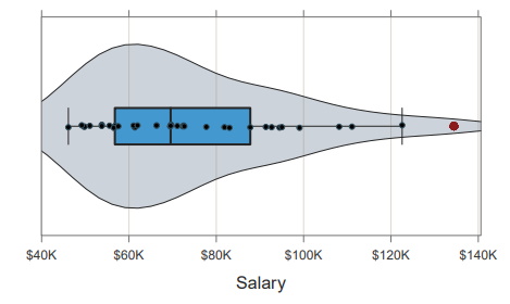
Two other kinds of plot that you might have seen when you were younger are Box Plots and Scatter Graphs. In a Box Plot, a ‘box’ is used to represent where the median and upper and lower quartiles of the data lie. Tails or ‘whiskers’ then extend from the box to represent the overall range of data. Outliers are identified in accordance with Tukey’s rule: points more than 1.5 times the interquartile range beyond the upper or lower quartiles are marked.
Finally, a one-dimensional Scatter Graph simply marks each of the individual data points on a line. This makes sure that all the information is retained, but no helpful summary statistics are displayed and individual points can become obscured when lots of data is plotted on top of one another. So, is there a single straightforward, but sufficiently detailed way to visualise data?
The Combined Violin-Box-Scatter Plot
Professor Gerbing from Portland State University has suggested that several well-known data representations might be combined into a single figure, which he calls a Violin-Box-Scatter (VBS) plot. A VBS plot would have all the advantages of its components, and could be generated quickly by a computer. Prof Gerbing argues that VBS plots can serve as a successor to histograms, providing a visualisation of data that’s detailed, intuitive, and more suited for the digital age.
A VBS plot involves both Box and Scatter plots superimposed over a Violin plot. A Violin plot is an alternative to histograms which smooths the data into a curve instead of discrete bars. This curve is then mirrored in the horizontal axis, so that the result is something that looks like the musical instrument. The principal advantage of the Violin plot is that it can be stacked. Suppose you want to split data into two or more categories – for example, you might be interested in the distributions of salaries for men and women separately – stacking plots on top of each other allows you to compare the distributions within the different categories. Histograms are often taller than they are wide, which makes it difficult to stack, whereas the opposite is true for violin plots.
So, Violin plots avoid some of the main pitfalls of histograms while offering an intuitive visual representation of the data distribution. Thus, they serve as the foundation for Prof Gerbing’s VBS plots. By overlaying the associated Box and Scatter plots on top, one can also see exactly where the individual data points fall, statistics about their spread, and whether there are any outliers. But, if you wanted to create a VBS plot from scratch, several parameters – such as point size, minimum separation, how to mark outliers – would need to be adjusted to make sure the resulting plot was clear and visually appealing. That would be a lot of work, unless there was a digital tool that could do all of this for you automatically…

Making Data Analysis in R More Accessible with LessR
Data analysis is often performed using dedicated computer software, and one of the most popular programming languages for it is R. It features many powerful tools for data visualisation, but using them effectively can often require multiple lines of code and technical expertise. Prof Gerbing’s new VBS plots form part of his larger project, which is the development of a package for R called lessR. lessR aims to make R, and data analysis in general, much more accessible and straightforward. The package has already proved a hit, with upwards of 1000 downloads a week.
One of the main features of the lessR package is that it can generate some of the most commonly used kinds of data visualisations in just a single line of code, when using simple commands such “BarChart(Dept)” to get a bar chart for the variable Dept and “Histogram(Salary)” for a histogram of salary. But Prof Gerbing wanted it to be just as easy to generate his more sophisticated VBS plots. So, he built in the “Plot()” command, which generates a whole VBS plot for a given data set automatically, such as Plot(Salary).
To create an optimal plot, the Plot function analyses the data set and adjusts various parameters, to make sure that the figure produced is as clear as possible without need for further coding. For example, the Scatter plot component can be problematic for particularly large data sets and make the resulting figure look messy. To compensate for this, the Plot function automatically adjusts two properties: point size and jitter. Jitter randomly displaces points in the vertical direction to help spread them out. Then, the Plot function checks to see if too many points are being placed on top of each other and compensates by reducing the size of the points or increasing the vertical jitter until this is no longer the case. If more specific adjustments are required – perhaps you want to colour-code data or include labels – there are plenty of options one can use to edit things manually.
![]()
Powerful Data Analysis Made Simple
The creation of VBS plots is just one part of Prof Gerbing’s mission to make sophisticated data analysis more accessible. His overarching project, the continuing development of lessR, offers a simple way to generate common data representations with just a single line of code. Prof Gerbing believes there are better ways we can standardly represent data. VBS plots combine the best features of Violin, Box, and Scatter plots, and now, with lessR’s Plot function, Prof Gerbing has done all the hard work for you, so you can make detailed, visually appealing VBS plots with just a single, simple instruction. And, this easy to use software is free, with no restrictions on its distribution.
SHARE
DOWNLOAD E-BOOK
REFERENCE
https://doi.org/10.33548/SCIENTIA1315
MEET THE RESEARCHER

Professor David Gerbing
The School of Business, Portland State University, Portland, Oregon, USA
Professor David Gerbing is a leading academic in the field of data science with over 85,000 citations in the scientific literature. One of his most popular recent projects has been the development of lessR, a package for the widely-used and free data analysis programming language R. One of its goals is to make data analysis within R much more accessible. Commands for the visualisation of data and the generation of statistics are simplified so that key elements of data analysis can be performed even by someone who is not an experienced programmer. The package is so popular it’s being downloaded more than 1000 times a week. Professor Gerbing obtained his M.A. and PhD in Quantitative Methods from Michigan State University in 1976 and 1979 respectively. In 1987, he joined the Portland State University School of Business where he still works today as Professor and the primary technical resource in the Master of Science Degree program, Applied Data Science for Business (MD-ADSB), offered by the School of Business, Portland State University, Portland, Oregon, USA.
CONTACT
FURTHER READING
D Gerbing. R Visualizations: Derive Meaning from Data, 2nd Edition, CRC Press, (forthcoming).
D Gerbing, The Integrated Violin-Box-Scatter (VBS) Plot to Visualize the Distribution of a Continuous Variable, Stats, 2024, 7 (3), 955-966. DOI: 10.3390/stats7030058
D Gerbing, Enhancement of the Command-Line Environment for use in the Introductory Statistics Course and Beyond, Journal of Statistics and Data Science Education, 2021, 29(3), 251–266. https://doi.org/10.1080/26939169.2021.1999871

REPUBLISH OUR ARTICLES
We encourage all formats of sharing and republishing of our articles. Whether you want to host on your website, publication or blog, we welcome this. Find out more
Creative Commons Licence (CC BY 4.0)
This work is licensed under a Creative Commons Attribution 4.0 International License. 
What does this mean?
Share: You can copy and redistribute the material in any medium or format
Adapt: You can change, and build upon the material for any purpose, even commercially.
Credit: You must give appropriate credit, provide a link to the license, and indicate if changes were made.
SUBSCRIBE NOW
Follow Us
MORE ARTICLES YOU MAY LIKE
Running on Empty: Climate Change and the Future of the Colorado River Basin
Amid growing pressures from climate change and population growth, water availability in the Colorado River Basin is declining while demand continues to rise. At the Water Dialogue Lab at the University of California, Riverside (UCR), Prof Mehdi Nemati and his colleagues, Dr Daniel Crespo, Prof Ariel Dinar, and Ms Paloma Avila from UCR’s School of Public Policy, along with Mr Zachary Frankel and Mr Nicholas Halberg from the Utah Rivers Council, have developed integrated models to assess changes in water availability, use, and associated economic values across the Basin. Their research evaluates the effects of climate change and policy interventions on both physical water supply and economic outcomes. Their findings highlight the need for adaptive planning, improved economic resilience, and policy reforms to ensure long-term sustainability in the region.

Professor Yves R. Sagaert | Demand Planning Excellence: The Case for Incorporating Macroeconomic Leading Indicators
Today’s demand planning landscape is increasingly defined by radical uncertainty. Professor Yves R. Sagaert from the research group Predictive AI and Digital Shift at VIVES University of Applied Sciences is one of many scholars who posits that to survive and thrive in this new normal, demand planners must consider incorporating leading macroeconomic indicators into their demand forecasts. This field of research is vital for better understanding how the early warning signals in leading macroeconomic indicators can be used to inform precision forecasting and minimise forecast-reality variance.
Dr Alexander Scholze | Digital Transformation in the Workplace: Navigating the Balance Between Demands and Resources
What if your digital tools, designed to help you, became the very reason for your burnout? In today’s rapidly evolving digital landscape, organisations face the challenge of implementing technological changes while safeguarding employee well-being. Dr Alexander Scholze has developed a theoretical framework that comprehensively examines how digitalisation affects workplace dynamics, particularly focusing on job demands and resources. His research offers valuable insights for organisations seeking to harness the benefits of digital transformation while mitigating potential negative impacts on employee health and motivation.

Professor Jean-Philippe Bouchaud | The Inelastic Market Hypothesis: Explaining the Origins of Financial Fluctuations
What drives movements in asset prices? Are markets efficient, with prices reflecting underlying fundamentals, or do uninformed trades impact prices long-term? Professor Jean-Philippe Bouchaud from Capital Fund Management and Académie des Sciences has devoted his career to developing models that can explain the complex dynamics of financial markets. His work provides compelling evidence that order flow itself, rather than just incoming information, is the primary driver of price changes. This finding has important implications for our understanding of markets and the strategies of traders, fund managers and policymakers.