
Kimberly Kowal Arcand – Somewhere, Outside The Rainbow
Outer Space. It encompasses distances we can barely fathom, temperature ranges we can hardly comprehend, and shines in wavelengths which we can never see.
Take our Sun, for example, a fairly small star at a mere 1,392,000 km in diameter. Most of us can’t hold that number in our heads – it’s too far outside anything we’ve experienced. We can try to visualise it by comparison to distances that we know – say, the distance between New York and London. That’s 5,500 km, which means it would be around 252 trans-Atlantic flights. Assuming each flight is 7.5 hours then you’ll be spending 78 days in an aeroplane. 78 days’ worth of aeroplane food – now that is a number we can get our heads around.
But it gets even more difficult when we start looking at larger objects. Alpha Centauri, our nearest neighbouring star, is 4.3 lightyears away – converted to kilometres we get 41 followed by twelve zeroes. Twelve! You and your aeroplane food would be dust long before you even came close to your goal, and this is before we start trying to wrap our heads around deeper space objects like supernova remnant Cassiopeia A, a mere 10,000 light years away.
So how do we bring these distances and these objects down to our mortal world of commuter jets and slow-moving traffic? This is where the work of scientific communicators and researchers such as Kimberly Arcand of NASA’s Chandra X-ray Observatory comes in. Her job involves taking arcane data and scientific information and finding the best way to make them understandable for all walks of life.
254 Shades of Grey
When we look out our windows at the world passing by, we see reds, blues, greens, all the colours of the rainbow. But the rainbow we see is a tiny, tiny part of the rainbow we could be seeing, if only we had the ability. Infrared cameras, radar, X-ray telescopes: all of these rely on being able to ‘see’ wavelengths which are invisible to our naked eyes. But once detected, how do we visualise this information? What colour is that radar image or ultraviolet source?
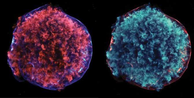
One traditional approach used by scientists has been to ignore the problem entirely, plotting all information on a scale from black (no signal) to white (100% signal) and then dividing everything else into various shades of grey. This is unambiguous, you can easily see how different parts of the image relate to others by examining how bright they are. But it becomes difficult when different images are merged – is this bit of grey part of the first image or the second? It also misses the chance to include important information. We see in colour and are thus skilled at interpreting and understanding multicoloured images (unless levels of colour blindness come into play).
But translating the invisible world into glorious colour brings its own challenges. As Kim comments: ‘There are human biases that are introduced in that translation process. There are many choices that must be made along the pipeline, from cleaning the data and removing artefacts to more aesthetic issues such as mapping colour.’ The way we respond to colour affects our interpretation of the imagery.
Take recent work by her group, in which they surveyed a number people regarding their perceptions of various astronomical images. The information was drawn from data outside the visible spectrum and thus was represented using ‘false-colour’ imagery, in which the colour in the pictures isn’t the same as we would see looking through a pair of binoculars (because of course, we couldn’t see it at all). High-energy regions were marked in blue, low energy in red. This makes perfect sense to an astronomer, because high-energy objects are hotter, and hotter objects are blue. However most of us think of red as being the colour of heat, despite this not being the case. Want to check this? If you were to stick your hand in a candle flame, the blue part of the flame is far hotter than the red… but kids, don’t try this at home!
This mismatch in beliefs means that effectively showing scientific data to nonexpert audiences requires scientists to reflect on some of their standard approaches. What is important is in getting the information across to the audience, not slavishly holding to a single manner of representing it. But most importantly, we also need to explain why these colours were chosen and what they represent.
The vast majority of questions which came up during the survey asked about the colours of the astronomical objects – do they really look like that? Are those colours real? In a world of easy photoshopping and Instagram filters we tend to distrust the images we see, and thus scientists need to be transparent about what they are actually presenting to the world.
Download
Listen
Share
‘It’s an honour to serve the public in any way, working on a publicly funded program as I am. I’m well aware that I’m not saving the world with my job, but I am hopefully helping to make a difference in someone’s day.’
Science for Everyone
Why is this important? Does it really matter that science looks pretty? Should it be optimised for just the people who research the data? Definitely not. Science and scientific discoveries affect all of us, they underlie the modern world in which we live. Unfortunately, however, science is often portrayed and perceived as being just one of those things that nerds do. That perspective, however, can actually limit the people who are interested in the field and so becomes self-selective – the more your 5-year old thinks that science is for nerds, the less likely they are to be interested in learning it themselves.
This is particularly a problem for girls, who are consistently underrepresented in a number of the STEM fields (science, technology, engineering and mathematics). The typical example here is computer science, for which only 10–20% of computer science degrees are awarded to women. However, it is also very noticeable in fields such as astronomy where female participation rates range from 15–35% (this applies to those amongst the stars as well – only 75 of the 560 astronauts trained so far have been women).
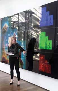
A number of new community-based programs exist to encourage young girls to develop an interest in computer science, but few equivalents exist for the field of astronomy. To attempt to fill this gap, Kim Arcand has been involved in developing public engagement programs from her position at the Chandra Observatory. Her and her colleagues most recent work has combined computer science and science imaging, teaching students how to take astronomical data and then use them to create their own imagery. Built on a simplified coding language known as PencilCode, the program takes young students through some standard stages of recolouring and merging images derived from orbiting telescopes – using real NASA data just as an astronomer would.
This type of hands-on program that provides authentic scientific learning experiences is a vital part of encouraging young minds to see science as a thing of possibility and interest. Although those who take part may be many years away from beginning their careers, they can see that science and associated fields are more than just hideaways for geeky guys with, perhaps, underdeveloped social skills. Science is fascinating and should be accessible to everyone – boys and girls, burnt hands and all.
Tedtalk (CREDIT: Tracy Karin Prell)
Touching the Stars
One of Kim’s latest attempts to making science more accessible to broader audiences involves improving the visualisation of astronomical objects. How? By shrinking them down to scales which we can hold in our hands. To achieve this mammoth act of scaling, they started with one of the most striking radio sources in the sky, Cassiopeia A. Cassiopeia A (Cas A for short) is what is known as a supernova remnant, the last remainder of a star’s final, dramatic moments. Supernovae occur when some large stars (much bigger than our Sun) run out of fuel for their inner fusion reactions, collapse under their own weight, and then rebound with enough energy to blow themselves apart. This turns the now ex-star into a rapidly expanding cloud of incredibly hot gas and plasma, shining brightly in almost every part of the electromagnetic spectrum we care to examine.
Cas A is well-loved by astronomers because the supernova was both relatively close (a mere 11,000 light years!) and relatively recent – this means that it is perfect for in-depth studies at a multitude of wavelengths. Imaging from the different orbiting observatories allows us to ‘see’ the remnant in visible, infrared and X-ray spectra; faint filaments in the visible spectrum become blinding clouds in the X-ray images.
Even better, the combination of these spectra provides information on how the gaseous shock-wave is moving. As parts of the cloud move towards or away from us, the wavelength of the radiation they emit will seem to be a little higher or a little lower than it should – a process known as Doppler shifting. Just as you can tell whether the police are coming towards you or driving away by the shifted tone of their siren, so can astronomers decide if part of the supernova remnant is moving towards or away from us.
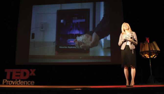
By combining this information together, then modifying a piece of software which was originally designed for medical scans of human brains, researchers have managed to create a 3-dimensional model of Cas A. It’s great news for those who work on computer models of supernovae for a living, but even better for the rest of us because the model can be fed directly into a 3D printer. Have you ever wanted to hold a supernova in your hands? Poke at a very, very much smaller representation of its hypersonic shockwave? Enjoy the irony of trying not to break the surprisingly fragile representation of two ‘jets’ of supernova material, each of which are in actuality moving at about 14,000 km every second?
By being able to do this, to ask these kind of questions, researchers such as Kim Arcand help to bring the idea of astronomy to a much wider audience than would otherwise be possible, from young learners to the visually impaired. You may or may not be a regular reader of astronomical papers on ArXiv, but the little model of a dead star sitting on your desk helps to keep the idea of the wider, ridiculously larger universe in your thoughts. As she comments, ‘the visual is also only one side of the equation.’
Coloured galaxies, printed supernovae, public engagement programs for underrepresented groups, incidentally working at NASA, one of the most beloved government agencies in the US. How does Kim Arcand actually find the time to do all of this? She enjoys the challenge, laughingly commenting ‘I have the opportunity to learn something new every day and I take full advantage of it. That’s incredibly important to me.’ Every day brings something new, every day another challenge and another possible success. I, for one, am curious to see what tomorrow brings.
Meet the researcher
Visualisation Lead for NASA’s Chandra X-ray Observatory
Smithsonian Astrophysical Observatory
Cambridge, MA USA
Kim Arcand has a long history of bringing science to the public, starting from her early career in parasitic and infectious diseases and stretching through to her current role as Visualisation Lead for NASA’s Chandra X-ray Observatory. She is an award-winning producer and director, and a leading expert in studying the perception and comprehension of highenergy data visualisation across the novice-expert spectrum. She has spear-headed the creation, distribution, and evaluation of large-scale science and technology communications projects. As a science data ‘story teller’, Kim combines her background in molecular biology and computer science with her current work in the fields of astronomy and physics. She presented the TEDx talk ‘How to hold a dead star in your hand’ in April 2016 and co-wrote the non-fiction books ‘Your Ticket to the Universe: A Guide To Exploring the Cosmos’, ‘Light: The Visible Spectrum and Beyond’ and ‘Coloring the Universe: An Insider’s Guide to Making Spectacular Images of Space’.
CONTACT
E: kkowal@cfa.harvard.edu
W: http://www.arcandwatzke.com/kim
Twitter, Instagram: @kimberlykowal
KEY COLLABORATORS
Megan Watzke, Peter Edmonds, Kathy Lestition, Wallace Tucker, Joseph DePasquale, April Hobart, Khajag Mgrdichian, Kayren Phillips, Kristin Divona, Mel Weiss, Smithsonian Astrophysical Observatory (SAO)/ Chandra.
Randall Smith, SAO
Lisa F. Smith, University of Otago, New Zealand
Jeffrey Smith, University of Otago, New Zealand
Travis Rector, University of Alaska, Anchorage
Zoltan G. Levay, Space Telescope Science Institute
David Bau, MIT
August Meunch, American Astronomical Society
Matthew Dawson, Google CS First
Tracey Delaney, West Virginia Wesleyan College
REFERENCES

NASA’s Marshall Space Flight Center manages the Chandra program. The Smithsonian Astrophysical Observatory controls Chandra’s science and flight operations.